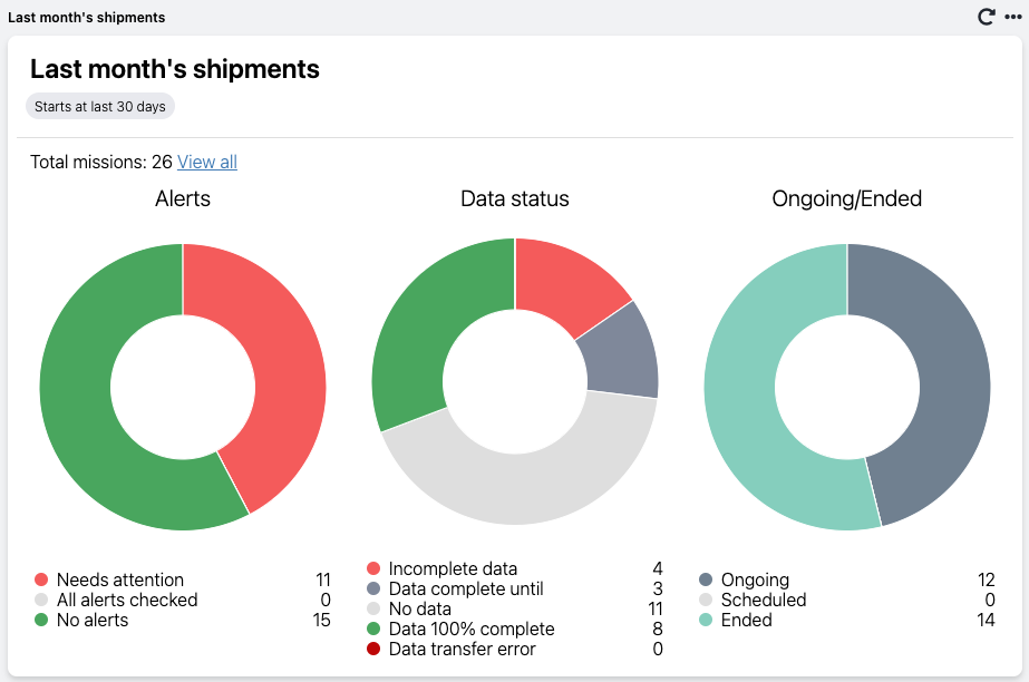
Mission group overview shows the general status (alerts, data status, and ongoing/ended) of a particular group of missions. The number of missions corresponding to each subcategory is indicated.
You can click on the name or the pie chart column of each subcategory to view the corresponding missions as a filtered table on the Missions page and then inspect them individually if needed.
- Go to the Dashboard in your Logmore Cloud.
- Scroll down to the bottom of the page and click Add report.

- Select Mission group overview.
- Add filter(s) for the report to display the missions you're interested in (e.g., shipped via a certain route or for a specific time period). Check this article for more details on adding filters.
- Click Next.
- Enter the Report name to match the type of data displayed.
- Click Save report.
- You can hover with the mouse over any part of the chart to view the details. Clicking on that bar will bring you to the Missions page and show only the Missions in question.

This piechart helps quickly check the data status for the last month's missions and overview the general status of shipments.